
10 WAYS TO KEEP VISITORS FROM LEAVING YOUR WEBSITE
You've only got a few seconds to pique the interest of visitors on your website so they don't hit the big red “X” in the corner and leave. Today, I’m breaking down 10 ways to make sure visitors dive deep within your site and you get them to convert.
1. WRITE OUT YOUR HOMEPAGE GOALS
Determine your website homepage goal. While this might sound obvious, and quite easy (you’re probably thinking, “Um, I want my website to make me money”), it’s a little more detailed than you’d think.
We need to break down who might be coming to our website, what they might be looking for, and how we can guide them through our website to hit key sections that convince them to pop their info in the form on our contact page.
So if we take my site, for example, I might be having visitors come to my site to work one-on-one for branding, web design, or photography. But I might also have somebody coming to my site looking on how to purchase stock photos AND then still have a visitor searching for actionable education.
Three different visitors = three different journeys
For example, I'd want to take the visitor that's looking to work with me one-on-one into my experiences page to learn about the process, on through to my portfolio so they can see work that I've done, and then on over to the contact page to schedule a call to discuss our project in detail.
I want to make sure that my homepage is guiding them on their own route so that they don't stop and say, “Hey, there's nothing here for me”.
So review your homepage, write out your goals, and determine who's coming to your website and where we want to take them.
2. MAKE WHAT YOU DO CLEAR
From the second visitors land on your homepage, they need to know exactly what you do. The majority of visitors won’t spend more than a minute trying to scour your homepage to find out the answer to this basic question.
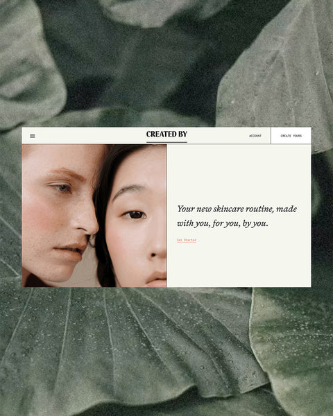
The easiest way to ensure that what you do is clearly communicated on your homepage, is simply to make sure your header image clearly showcases what you do. If you shoot wedding photography, there should be an image of a couple up there, or of you in action. If you're a copywriter, there should be an image of you on a computer, a picture of pencils and pens, or a styled image of a keyboard. If you are a product based business, showcase your products.
One you have your image, drive the point home with a short, relevant heading text. For example, “a Carolinas wedding photographer for adventurous couples”.
3. BREAK THINGS DOWN
Write tons of copy and people become disinterested, but grab their attention early and they'll read for days.
Your homepage should have the teasers to the big content, never filled with tons of copy, but with eye catching headings, subheadings, images, and buttons to take them on through to your full content. If you have different areas that you want to guide people on through to, break it down.
As an easy rule of thumb, break things down into threes. Break copy down so it's easy for visitors to skim your website and actually consume the content that you're putting out there, and break images down into threes to guide people on three different journeys.
4. MAKE THE EYES DANCE
This is my favorite phrase and a phrase that you'll often hear my clients repeat again and again, plus it's the most fun on this to-do list.
It's my way of saying keep the design interesting. Make the visitors eyes dance as they glide their eyes down the page. The easiest way to achieve this is through a zig zag pattern.
Ensuring that when we have an image on the left side of our screen, we immediately counter that with an image on the right in the next section below – creating a zig zag pattern with images as our eyes glide down the page.
But if we simply continued that pattern, our visitors would get bored quickly. So break up the design with full banner-width sections that hold testimonials, quotes, videos, or any other pertinent headings, details, and facts.
So think of it like dancing. We want to make sure that each 8 count looks a little bit different, keeps it interesting, and we're not repeating the exact same series of moves back to back.
5. COPY BEFORE DESIGN
Think about the copy that you want to have on your website before you go into designing it.
As intriguing as it can be to dive straight into design, we’d end up forcing copy into a template design, ensuring a pretty website, that simply isn’t built to convert.
Sit down, write out your copy ahead of time, figure out what answers your client is searching for on your website, and what you’d love to share with them.
This will help ensure that we're not having thoughtless words that just fit into a certain website design template, but that you're truly speaking straight to every visitor that lands on your site and we're not just giving them some fluff.
6. USE CRISP, STUNNING IMAGERY
Your website, especially your homepage, is a very clear indicator of what it looks like to work with you. The images on your site reflect the quality of work you produce and provide insight to a potential client.
The higher quality images you have the more you can easily build trust with each visitor.
When there is a grainy or blurry image, it's dark or dull, or it looks like you took it in your home, that creates mistrust.
We don't want even an ounce of that mistrust.
That is what leads them to the big red x. That is what leads them away from your website.
Here are a couple of quick tips on how you achieve those crisp, stunning images –
1. Schedule a brand photo shoot. If you have a local photographer that you love, get them on over to do a brand photo shoot in your office.
If you don't know anyone local, um, hey, I’m here! You could reach out to me and we can work together to create some beautiful brand images. Even if you're a service based company, even if I'm not near you, we can create some stunning images to reflect what you do, with your brand in mind, to make sure that we're creating that consistent message across the board to your visitors.
2. Utilize stock imagery. If you are not able to afford custom brand photography, that's okay! Utilize stock photography where you're going to get those crisp professional images at a fraction of the price.
If you head on over to KF Stock Studio, you can find on-brand images for only $10 a piece. That is my stock studio, where I personally take every photo to ensure that they are on brand for you.
While you're there don’t forget to grab 15 free photos by signing up for our newsletter list!
7. SIMPLE NAVIGATION
We want to make sure people can find what they need while they’re exploring your website.
So don’t get too creative with those menu navigation words.
“Services” works perfectly fine, “Portfolio” does the trick, and “Contact” is amazing.
Using different words can overwhelm a visitor, cause frustration, and lead them to leave your site before they’re able to consume any content.
While we don’t want it to be overwhelming, we don’t want it to be underwhelming either. Having too few menu navigation options can lead a visitor to feel like they can’t find the answers to their questions and leads them to that big red “X”. Although you might want visitors to inquire for additional question, most won’t bother filling out the form if they can’t find the answers to the basic questions on your site.
You want to make sure that you have your basic navigation, which is a home page, an about page, a services page, a portfolio page, a blog page, and a contact page. That's if you're a service based company.
If you're a product based company, you want to make sure that you have a homepage, an about page, a shop, an FAQ section, a blog, and a contact page.
If you happen to have more than that, that’s totally okay! To ensure the visitor doesn’t become overwhelmed, simply tuck those additional pages under a dropdown in the main navigation, or move the less important ones to the bottom in your footer.
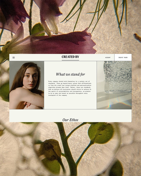
8. KEEP IT CONSISTENT
Make sure you weave every portion of your brand throughout your website, that includes fonts, colors, copy in your brand voice, and images in your brand style.
The main things are those fonts and colors because they're so easy to implement throughout your website. Head to the section where we're able to pick your fonts, make sure you're grabbing those exact ones, and then add in those specific color numbers. A slight change in the shade of a color can be all the difference in the emotion that comes through with your brand.
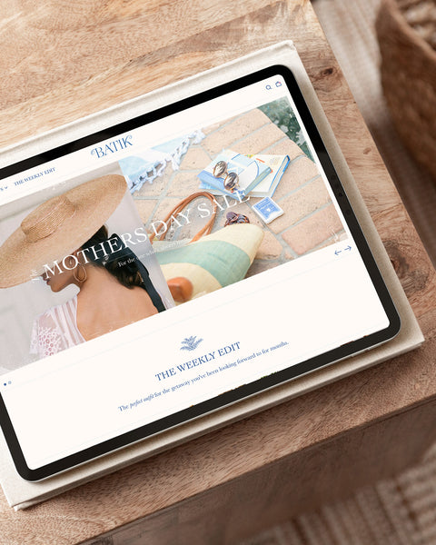
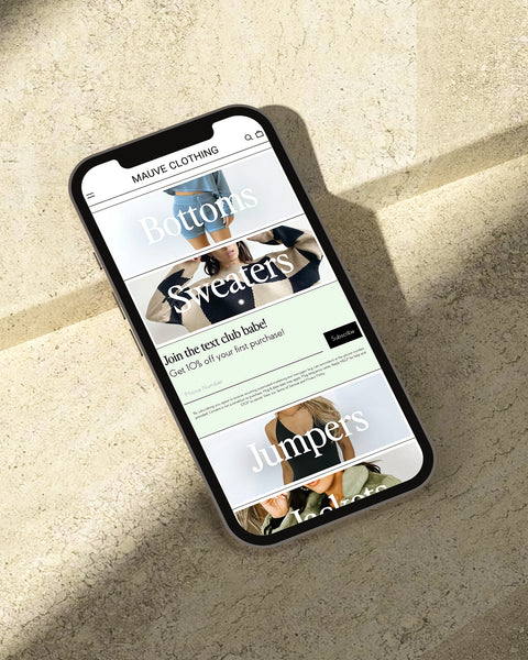
9. MOBILE FRIENDLY
Nowadays, the majority of us are using our phones to navigate a website.
We click on through to sites from Instagram, Facebook, Twitter, Youtube, and a several other apps and sites.
If that website is not easy to navigate on a mobile device, we're most likely going to close that browser and go back to that original app that we were on.
Every single website platform that we design on (Shopify, Squarespace, Showit, and Wordpress) offer a way to customize the mobile version of your site or have a way to automatically adapt it for mobile. So make sure you're taking advantage of that tool.
10. SPEAK DIRECTLY TO YOUR VISITORS
The last and final must have very homepage is that it speaks directly to your visitors.
So walk through your home page from a visitor's perspective, pretending that you are your ideal client. You can even name yourself! Walk through it and ask, “Can I find what I'm looking for?” “Does this show me what it would be like to work with her?” “How much would it cost?” “Am I getting all of that information when I walked through the homepage?”
And then walk through it again, ensuring there are no broken links or misspellings, both of which create mistrust and prompt a visitor to leave your website.
Ensure that your entire site is 100% consistent from the visitor's perspective.
DESIGN A WEBSITE BUILT TO CONVERT
Your homepage is the one place that can exude your brand emotions, fully captivate visitors, and allow them to dive deep within the contents of your website and get to know all about your wonderful business.
Intrigue them, capture them, and turn them into beautiful referral giving clients.

Comments (0)
There are no comments for this article. Be the first one to leave a message!